Smartwatches find themselves in a odd place as we head into 2016. It's been just shy of two years since a swathe of devices flooded the market, and to this day few of them have been able to make a significant impact. One of those few was the Moto 360 from Motorola. While the device's UI did not separate it from the crowd, it's large round aluminium frame was certainly eye catching amid the square form factors that most smartwatches adopted at the time. Now the second iteration has arrived and that unique character seems to be missing.
Imitation game
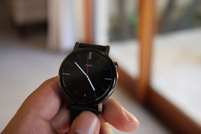
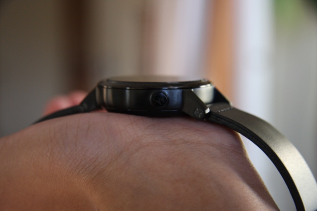
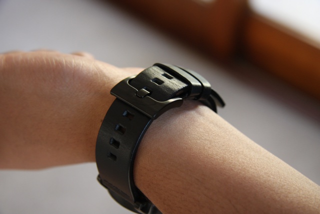
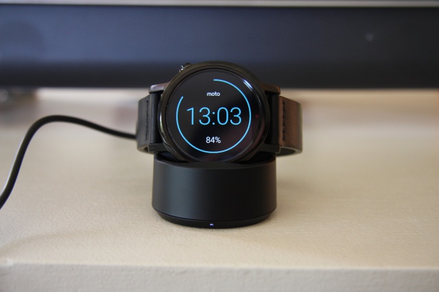
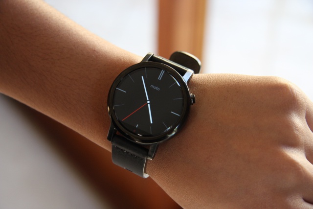
Perhaps a consequence of being a smaller 42 mm version, the Moto 360 (2nd Gen) feels more like a toy and less like a timepiece, which the previous model did not do. In fact, the Moto 360 now bears more of a resemblance to the LG G Watch R (review), than a smartwatch with a character all its own. It's not simply the black watch face and bezel that do a best impression of the G Watch R, but also the strap, which feels a little cheap compared to the weighty Moto 360 body (49 g).
While lighter is often favoured in the consumer tech world, the Moto 360 bucks the trend in a good way. As such, it has enough sturdiness to it to make it feel up to the challenge of a few knocks. I would however opt for the 46 mm version, as the 42 mm model's 1.37" (360x325) display looks a tad small on the wrist. That said, the screen is crisp, registering 263 ppi pixel density to make text and icons clearly visible. It is important to note that one of the higher screen brightness settings is needed, as the auto-level was a bit dull, which becomes a problem when operating outdoors.
More of the same
Running things on the Moto 360 is Android Wear, the go-to operating system for most smartwatches not coming out of Cupertino. Although it features the same OS as many of its compatriots, the Moto 360 is streaks ahead when setting up, pairing with either an Android (4.3 and up) or iOS (8.2 or better) device via low-energy Bluetooth 4.0 in next to no time.
That's where the differences end however, as the Moto 360 does the same as what most other Android Wear smartwatches do. To Motorola's defence however, the smartwatch market in general is a little guilty of having manufacturers imitate one another. The Moto 360 caters to all the usual notifications, with text messages, emails and Google Now cards all routinely popping up on the display for viewing. Actioning items from one's wrist however yields mixed results, as certain apps are not fully optimised for use on the Moto 360.
This issue also arises in the settings menu. When trying to setup or connect to a new Wi-Fi point for example, the smartwatch can pick up all the available Wi-Fi networks in the area, but actually joining it requires accessing one's smartphone. This ultimately feels counterintuitive, and while this is a symptom that most smartwatches suffer from, the Moto 360 does nothing to help alleviate this ailment.
A few extras
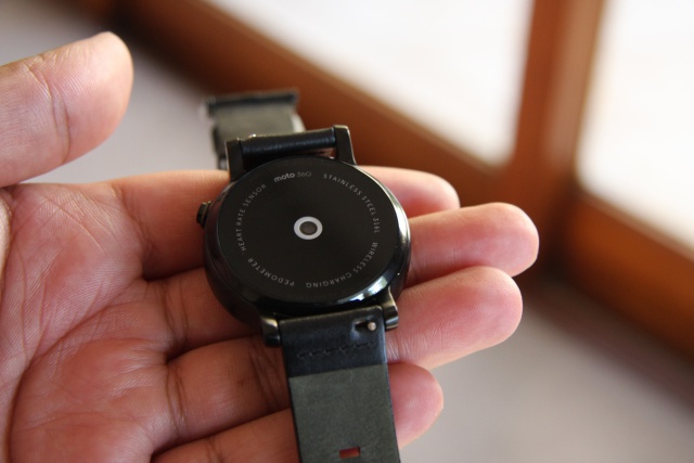
Added to the smart functionality, Motorola has a range of health and fitness focused applications embedded into the Moto 360. Core to its operation is a heart rate monitor and activity tracker. The latter counts steps and produces a graphic to show how active you've been throughout the day in meeting daily goals. The heart rate monitor works as needed, but is not ideal for those aiming to train or workout with constant heart rate information flashing on the screen. One can get a readout for their heart rate over a specific time period, but users aiming to train in specific heart rate zones (such as with the Garmin Forerunner 225) won't get the most out of the Moto 360. As such, opting for fully fledged fitness wearable is the better choice here.
As far as noteworthy specs go, the Moto 360 is as solid as they come. Handling the processing is a Qualcomm Snapdragon 400 chipset, with a quad-core CPU clocked at 1.2 GHz. This is paired with 512 MB of RAM and 4 GB of internal storage, which is on par with most of the high end smartwatches on the market today. Keeping the lights on is a 300 mAh battery, which Motorola says can deliver 1.5 days of use. I was able to squeeze out a full day with roughly 20% battery life left. I'd say that a large chunk of that battery went to display brightness, which I decided to place on one of the higher settings. If however 1.5 days does not cut it, the 46 mm model has a larger 400 mAh battery that delivers 2 full days of use, according to Motorola.
Final verdict
The Moto 360 is not a standout smartwatch. But then again, there are very few, if any, that can claim to be. At the moment, I feel that smartwatches are designed for consumers who want the latest gadget. As such, you can do far worse than the Moto 360, which retails for R5 265 (price subject to change) from Orange.
The one aspect counting in its favour, is the fact that it pairs with both Android and iOS devices, which certainly makes it worth considering if the Apple Watch's price tag places it out of your reach. One important factor to be aware of though, is that an Android Wear powered smartwatch is best when Google forms part and parcel of one's tech experience. To that end, if you're constantly checking Google Now cards, use Gmail as your go-to mail client and make use of Google Play apps, then the Moto 360 is a worthwhile purchase.

_46mm_black_front.jpg)


