The Xbox One has certainly come into its own this year, with a number of superb exclusives. However, one area where the console has lagged behind the PS4 has been its interface. It wasn’t terrible, it just hasn’t been the most intuitive or nearly as quickly accessible as Sony’s console.
As of yesterday that changed, as the New Xbox One Experience debuted. First off, I must hand it to Microsoft – it takes some guts to launch a new UI just in time for Friday the 13th. As with anything launched on this auspicious date, the superstitious may ask whether the new development spells a dark doom for Xbox One, or on the converse, can it breathe new life into it ahead of the holiday season?

Horror averted
My first impressions lean towards the latter. The new user interface (UI), which weighs in at nearly 600 MB, is a substantially different one, more importantly, it’s also a significantly superior one.
One of the niggles that annoyed in the Xbox One’s previous interface was when moving between different tabs, with the machine seeming only too willing to slide out out of the home or games screen into the social screen or store. This irritation is no more – perhaps it met its fate at the edge of Jason Voorhees’ blade, when it went wandering out after dark in its pajamas. Meeting the same fate, it seems, are the bugs that plagued the beta version of the new update.
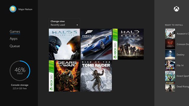
In the Xbox One experience, most commonly accessed games and apps are now front and centre and always given priority. This presumes that the game you were last playing - in my case the excellent Rise of the Tomb Raider (review) - is the one you have quickest access to the next time you turn the Xbox One on, and correctly so. Games that you have been playing lately are also arranged in a more logical manner, with the most often played games being at the top and the rest appearing beneath.

Knock on wood
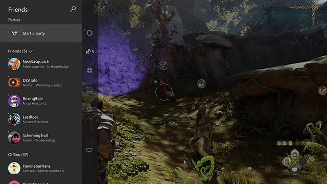
It also does something else which all successful UI’s should and just gets out of your way and allows you to access what you want, when you want. A prime example of this is the social aspect of the console, such as seeing your friends, starting a chat, sending messages and receiving notifications, which is now much more accessible.
These, along with shortcuts to settings and your profile, are now more available now when you want them – a quick tap backwards on the left stick brings up these options in their own vertically scrolling menu. Perhaps my best feature though is that you can bring up this same menu while in a game, without leaving full game mode, by double tapping the Xbox One button, without breaking one’s immersion as much as before.
Current downloads are also more easily visible on the home screen, which is another touch I liked.
What’s in store...
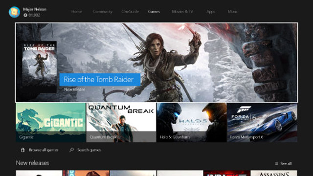
The store has similarly received a revamp, with content being grouped into games, apps, music and movies. Additionally new categories have been added to the list, which help organise content more effectively. These include newly released, top played and top rated (interestingly there is a difference), plus staff picks.
If you are concerned that you will lose your customisation or pins in the upgrade, don’t be. These can be recalled by connecting to Xbox Live, so all settings and customisations already made are preserved. There is one caveat though. I found that after the update, digital games required an internet connection in order for them to load – a problem when my modem conked in and I was waiting for it to be replaced. This thankfully doesn’t apply to disc based games.

Looking back to move forward
Leaving the best for last, the new user interface ushers in perhaps the most appreciable feature – backward compatibility for Xbox 360 games. This is perhaps the biggest deal of all, because it gives the Xbox One a formidable back catalogue of games. Admittedly, not all Xbox 360 games are supported yet, but apparently more will be added as time passes.
At launch though, there is a healthy list of more than a hundred titles that are compatible, with apparently hundreds more to come. One amongst many titles that is ready and waiting for players to swing their sword, cast magic spells and swear at the townsfolk is Fable II. Alas, standing between you and that revisit to Albion is a mandatory 8 GB patch. However, if you still have a robust library of Xbox 360 games that you intend playing on the next gen console, it makes a strong case to consider picking up the 1 TB version if you are a new buyer.
All in all, the new interface definitely breathes new life into the Xbox One. It does what I was hoping it would, bringing new features, and getting out of the way while offering a streamlined experience.


