HTC is no stranger to Windows operated phones, in fact they are the manufacturer of certainly the best previous generation Windows phone - the HD2.
Windows Phone 7 is of course a beast of a different nature, and if for whatever reason in the past you’ve owned a Windows based phone, take heart – Windows 7 is nothing like the clunky, fussy interface you’ve grown to hate. It’s unfortunately still a long way off from what’s on offer from phone operating systems the likes of Android and Apple’s iOS. More about that later though, let’s first take a look at the hardware.
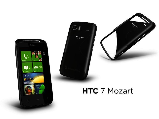
Mozart’s body
As almost expected from HTC hardware quality is very good. But then again with Windows Phone 7 Microsoft has implemented strict minimum hardware requirements on anyone manufacturing devices on which Windows Phone 7 (WP7) runs.
The most important of these is that a 1 GHz processor (or better) must be present. This ensures the phones are speedy and reports of a lagging Windows 7 experience do not surface. Which is definitely true of the HTC Mozart, a phone swift when browsing pictures and opening apps thanks to the 1 GHz Scorpion processor, onboard the Qualcomm QSD8250 Snapdragon chipset.
Microsoft also demands a generous 8 GB of flash memory to store music, videos and documents on, but unfortunately the Mozart has no MicroSD card slot to expand on this.
Furthermore the Mozart fits comfortably in hand thanks to a thin and light design and comes with a very decent 3.7” screen with an above average 480 x 800 resolution.
To differentiate the Mozart from a “generic” WP7 device tag, HTC paid a lot of attention to the musical qualities of the phone (Mozart, get it?). Included is SRS WOW HD for clearer and more expansive audio quality, but can only be activated by the Sound Enhancer app inside the HTC Hub on the phone, and not directly through the Zune media player.
Also available is an eight megapixel camera and 720p video recording, so multimedia on this phone is really strong.

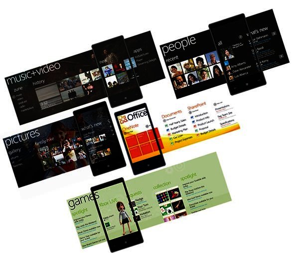
Examples of the different Hubs on offer, allowing you to move left or right for different sub divisions
Mozart’s brain
Windows Phone 7, launched at the end of last year, departs from the PC-like feel of Windows 6.5. It sports a uniformly cool, design-conscious interface and sure looks the part of a modern smartphone.
As far as looks are concerned, Microsoft’s general user interface differs from what’s on offer from the rest of the OS pack. You have your Start screen that is populated by “tiles”. These can be anything from links to your SMSs, Internet Explorer, different mail accounts or certain apps, with some of them displaying live info such as new SMSs received. Slide the screen to the left and you have all your different apps stacked beneath each other in one long list. Any one of these can be moved to the main Start screen for easy access and become one of the moveable tiles.
Although easy access to key functionality is available on the Start screen, if you think about it this is basically similar to one screen on an Android phone, which can also be populated with most important contacts and functionality. The problem with what's on offer from Windows Phone 7 is that you only have one Start screen and your long list of apps, compared to a minimum of five screens on Android that can be populated. One Start screen is simply not enough, nevermind if you can scroll down on this screen.
Some of these tiles available are what Microsoft calls Hubs, incorporating a lot more information and a well-designed interface once pressed. So for example, the “People” hub opens up to not only your phonebook, but also allows you to slide the screen right to recent contacts and your Facebook feed. It works well, with some of the apps available on the Microsoft Marketplace (still sparsely populated compared to others) incorporating a similar design.
Back, Windows and Search
On the Mozart you’ll find three soft buttons below the screen – Back, The Windows logo to go to the Start screen and Search. It’s almost similar to what’s on offer from Android, with the absence of a Settings button, which we felt could have been handy in the one or two instances that we were looking for certain key adjustments inside an app.
The Search button helps you find, for example, the person you’re looking for when you have “People” open, but when used from the Start screen opens up to Microsoft’s Bing search engine. It seems like its permanently tied to Bing, with no way to change this - unfortunate since after a few searches did not return what we were looking for, we downloaded the Google search app and left the Search button alone.
It’s a shame that it cannot be tied to Google, because it also impacts a very nice feature to Windows Phone - Voice Command. By holding in the Windows key you can say a command, thereby opening an app, calling a contact or searching the web. It’s very convenient and we used this a lot to call people, and would have done so more to search if it was not for Bing being used as the proprietary search engine.
Windows Live! and Zune
Just like the Android platform becomes a lot more accessible with a Gmail account, Windows Phone 7 needs a Windows Live ID to get the full experience. If you use a lot of the Microsoft services already, such as Xbox LIVE or Hotmail you will like the added integration for these. As can be expected Microsoft Office on Windows Phone is very strong and is one of the strongest documentation creation packages currently on offer on any OS.
One of the bigger problems for us concerns the fact that Windows Phone does not show up as a drive when plugged into your PC, so dragging and dropping files onto the device is out of the question. Synchronisation, at least for music and video, needs to be done via Microsoft’s Zune media player package, which by the way you would have to download first. It's exactly the same problem we have with the iPhone for which you need to use iTunes to transfer files to the phone. Now Microsoft, basically the inventors of drag-and-drop, is doing the same. Part of the reason for this is that upgrades to the OS can be done directly through Zune, with two updates already coming through – one basically for the ability to cut and paste, and the other for added security. Still, the inconvenience of having to use Zune did not do a lot for our love of Windows Phone.
Conclusion
There is nothing wrong with the HTC Mozart’s hardware - it works well in all regards and can’t be faulted except for lack of MicroUSB. The question is though whether you want to make the jump to Windows Phone 7 now while it's going through its teething phase.
It's an OS that’s about three years behind Android in general usage and updates, but that said a lot of the current niggles we experienced with Window Phone should be sorted out in the next few months, with the added boost of Nokia switching over to Windows contributing to what should be a much improved OS soon.
But at this stage though we just can’t find enough reason to pick Windows Phone above any other OS currently available (except Symbian). It retails for R5700.
Pro: 1 GHz processor, 8 GB worth of storage, decent sound.
Con: No MicroSD, have to use Zune to sync, Windows Phone 7 still going through teething phase.
PROS
1 GHz processor, 8 GB worth of storage, decent sound.
CONS
No MicroSD, have to use Zune to sync, Windows Phone 7 still going through teething phase.


