The Xperia Z is one of the first next-gen full HD smartphones to arrive locally and it’s not difficult to see that Sony has raised its game here. After ruling the pre-Apple smartphone days with quite awesome devices the likes of the P9000, Sony has struggled to reach that high mark again. Luckily the Z with its full HD screen shows that Sony is heading in the right direction.
Look and feel
Although it’s not that bulky, Sony’s Z is a big boy. With its 5” screen and quite a wide body, it feels a lot larger than the new 4.8” HTC One for example. Design wise it looks more like an iPhone, thanks to Sony opting for a more boxy approach, forsaking the pebble-like curves found on their Xperia arc (review). This right-angled design makes it feel quite large and not as easy to hold as the Galaxy S3 (review), even though the two are quite similar in width (71 mm vs. the S3’s 70.6 mm). The Z will not find much love from users with small hands, so if you thought that Samsung’s S3 is a bit too much phone to handle, you’re definitely not going to like the Z.
That is not to say the Sony Z is unappealing, since its design actually does a lot to distinguishing it from Android competitors. Sony includes tempered glass on both the front and the back (once again iPhone-like), with the battery built-in rather than being hot-swappable.

The power button protrudes enough to easily switch the Sony Z on and off.
We liked the on/off button on the right hand side of the Z since it provides an easy press, and sufficiently protrudes from the body to pre-empt having to search for it when you want to unlock the screen. The volume rocker is conveniently placed below this, which makes adjusting the in-call volume a breeze. In all, the design is solid.
No water, no cry
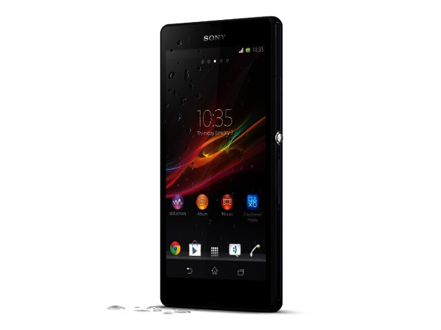
If you’ve ever lost a smartphone to water damage, the fact that the Xperia Z is water resistant to 1 m (and 30 minutes underwater) will be much appreciated. Of course we’ve tested this, and it works like a charm. On the side of the unit and the top of the unit you’ll find that all the ports are sealed off, which unfortunately also means that for the duration of the Z’s lifetime, you will have to unplug the little flap that covers the micro USB when charging.

Yes, you can actually do this.
The Z’s other impressive feat is the massive 5” screen with a full HD resolution (1920 x 1080) bringing pixel count to a lovely 440 pixels per inch (the much vaunted iPhone 5 Retina Display’s ppi stands at 326). It’s an absolute treat when watching movies or browsing pics, but it should be noted that not all 5” of the screen is always utilised.
The phone’s three main Android buttons - home, return and recent apps - are allocated space on the screen itself and not underneath on the body. This means that in most instances, only about 4.7” of screen is used for display purposes, with the menu buttons taking up the rest. Importantly, this is not the case when it comes to watching movies, pictures or using the camera, but does apply when surfing the net, using apps and reading Kindle ebooks.
If there is another thing to complain about, it’s the screen’s lack of saturation. When recording videos for example, there is a massive difference in the appearance of on-screen colour between the Xperia Z and the HTC One.
Storage and performance
At this stage, the Xperia Z runs Android 4.1.2 Jelly Bean with very little that Sony adds to the experience. We missed the ability to go directly to new SMS or WhatsApp messages straight from the lock screen as one can do with the S3.
Sony provides 16 GB of onboard storage, with the added benefit of a microSD card slot where you can inexpensively add up to 64 GB of extra space. This is great since you will be able to accommodate some full HD movies in your library.

The Sony Z's 5" screen is full HD.
As on most of the next generation phones you will find 2 GB of RAM onboard, with the processing done by the Qualcomm Snapdragon S4 Pro APQ8064 quad-core chipset that also does duty on the Galaxy Nexus 4. It runs at 1.5 GHz per core and laughs at the best benchmarking performances from last year.
For example, 2012’s strongest phone, the Galaxy Note 2 (review) with its 1.6 GHz Exynos 4412 quad core, achieved 13 683 in Antutu and 6579 in Smartbench 2012. The Z blows it away with 20 067 in Antutu and 7379 in Smartbench. It must be noted that the HTC One, with its Qualcomm Snapdragon 600 running at 1.7 GHz on each of its four cores, topped the Sony Z quite comfortably in all our benchmarks.
In general usage, apps opened quickly and we barely had to wait for home screens, app lists or recently used application screens. For those who hate YouTube videos buffering, the LTE capabilities of the Sony Z will come in very handy.
Camera
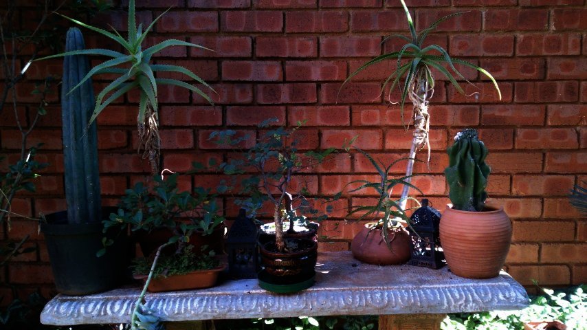
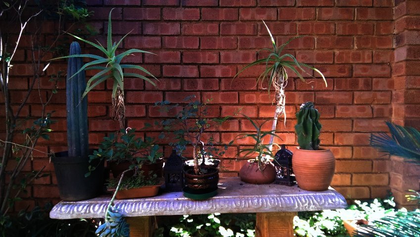
Although the screen is great, the onboard camera is not the Sony Z’s biggest asset. Our first qualm with its 13 megapixel shooter is the almost zoomed-in view that the camera delivers. More noticeable when taking photos close to the subject, the camera provides far less of a wide-angle than other shooters. In many cases it meant we had to move back to include what we wanted in a shot.


Photos taken with the Sony Z provides an almost zoomed-in feel.
Note how much wider the photo below (HTC One) is compared to the one on top (Sony Z).
Furthermore, the low-light capability of the Z is disappointing, with noise appearing in darkened areas of some pictures. To give credit where credit is due, autofocus is quite fast, plus macro is impressive. Sony’s picture effect mode also provides live previews from all the available options at the same time, making it easy to choose which effect will work (personally we liked the trippy Harris Shutter the most).
As far as Sony’s claims with regards to HDR video mode is concerned, it was not overly impressive, but does show its worth in situations where a strong backlight is present.
Onboard speakers and battery
Sound via the Z’s external speakers is not that great. Not only is it quite soft, but it also emanates from a small little hole at the bottom right corner of the device. It is very easily obscured by your hand in general usage, which can totally mute the audio.
As far as battery life is concerned, we did not do better than average on the 2330 mAh Li-Ion battery. Sony does add a Stamina mode power management application that turns off data when the screen is locked for better standby time, but it did little to enhance our time spent without a charger. Depending on usage you would have to recharge after the working day.

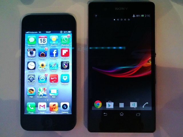
Compared to the iPhone 5, the Sony Z is massive.
To the point
Overall we were left with a good opinion of the Sony Xperia Z, but not an outstanding one. The 5” full HD screen is a treat (even though Sony cheats a bit with the menu, return and recently used apps buttons placed as part of the screen), while its waterproof build provides a peace of mind to those who’ve ever lost a phone to water damage.
The middling camera and speakers are a disappointment, while we also can’t help but wonder about the very bland Android experience on offer. Unlike HTC (BlinkFeed and Sense) or Samsung (SmartStay and a number of extras), Sony does not offer much in terms of creating extra features. Having said that, the company is pushing easy connectivity via Near Field Communication (NFC) quite a bit in all its product ranges, and features such as HDR video can help in certain situations.
Upon finishing this review, we’ve started testing one of the Sony Xperia Z’s main rivals, the HTC One. With this and the Samsung Galaxy S4 just round the corner, we can say that Sony better enjoy these few weeks of having no competition in the full HD smartphone market. Things are going to hot up very quickly.
The Sony Xperia Z retails for R8 000 in South Africa.
Pros
Full HD screen.
Interesting design.
LTE enabled.
Good performance and fast when you need it to be.
Water and dust resistant.
microSD card onboard.
Cons
So-so camera.
Onboard speaker not loud enough.
Very few extra features apart from regular Android offerings.
Boxy design does not sit well in hand.
PROS
Full HD screen; Interesting design; LTE enabled; Good performance and fast when you need it to be; Water and dust resistant; microSD card onboard.
CONS
So-so camera; Onboard speaker not loud enough; very few extra features apart from the rest of the Android offerings; Boxy design does not sit well in hand.


