The current direction among smartphone manufacturers is to not only make devices faster and more powerful with each iteration, but also fit them with larger displays. Nokia increased the dimensions of each Lumia device refresh, but never truly threw its full weight behind phablets in the same way that manufacturers like Samsung and HTC did. Until now, with the release of the Lumia 1520, a smartphone looking to give Nokia some parity in the phablet market.
Along with its increased dimensions, Nokia has equipped the 1520 with enhancements to the processor and firmware design. But will these refinements and increased screen size add up to a device capable of usurping the Note 3’s reign as phablet king?
Big and Bold
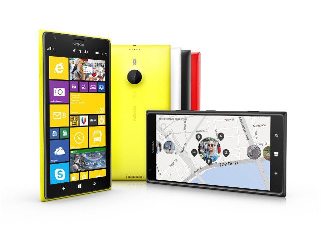
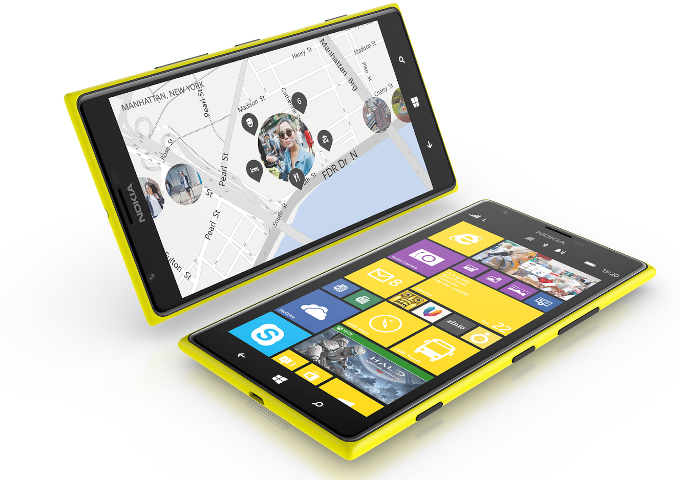
The first thing that hits you about Nokia’s new Lumia 1520, is its sheer size. This smartphone is massive, even when it’s placed alongside other phablet devices like the Galaxy Note 3 (5.7”). At 6” (diagonally), it is the Finnish company’s largest smartphone to date, fitted with a full HD (1920x1080) display, offering 367 ppi density.
The 1520’s ppi may not be the best on the market, but it is still extremely crisp and clear, with colours dynamically popping on the screen as well as white and black backgrounds looking luminous and deep respectively thanks to Nokia’s ClearBlack technology.
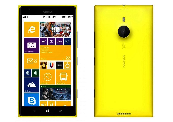
The look and feel of the 1520 are in keeping with the design aesthetic we’ve come to expect from Nokia and its Lumia range. Simple, clean lines give the 1520 an uncluttered appearance, with very few embellishments to speak of. The unit’s back casing is available in matte or glossy finishes; our review unit has a rather striking canary yellow matte finish, with other colour options including black, white and red.

Highly specced
When you add the vibrancy of the 1520’s colourway to its size, you get a pretty eye-catching smartphone. Nokia has fitted a micro-USB port for charging and computer hookup as well as pin push slots for the nano-SIM and MicroSD card. The tiny nano-SIM is another first for Nokia and the 1520, a sort of juxtaposition to the Lumia’s ample measurements, as smartphones keep getting bigger, the internal components shrink to make the most of the extra space. The 1520 incorporates Bluetooth 4.0, Wi-Fi and NFC functionality, as well as network compatibility with 3G and LTE bands.
Nokia has incorporated Qualcomm’s 2.2 GHz quad-core Snapdragon 800 processor for this new device, along with 2 GB of RAM and 32 GB of internal memory. The use of this new chipset translates to a responsive unit that makes Windows Phone 8 effortlessly easy to operate. When tested on WP Bench, the Lumia 1520 scored 471.61 on the speed test, this placed it 33rd overall, among tested smartphones, achieving a “great” rating across CPU, DATA and GPU categories.
The 1520 also boasts a new 20 megapixel camera that takes great photos, picking up all nuanced details that you would want to see. Nokia has made a concerted effort to ensure quality imaging is among the Lumia 1520’s top attributes, with its PureView lens ensuring each photo has optimal lighting and focus. Controls and editing with this smartphone is fairly quick and easy to understand, the aforementioned focusing can be slightly hampering, but this is only to ensure users capture the optimal image.
One of the applications Nokia is looking to highlight with the Lumia 1520, is Storyteller, an app that collates all photo, video and location content into a interactive digital scrapbook. Users can assign photos and videos to specific locations as well as annotate them, to provide a detailed look at your day to day experiences.
Storyteller was fairly quick and easy to set up on the 1520, with content intuitively archived and placed on a vertical timeline for users to scroll up and down on. The app also integrates a “Places” and “Favourites” section, which allows users to track where they have been. The potential for the Storyteller application is purely dependent on user generated content, this makes it a perfect tool for users that enjoy curating their lives and sharing content. This is one aspect where the 1520 really shines, as a strong companion for users looking to broadcast their lives.
Size has its downfalls
Although fitted with a larger display, it does not truly feel as though Nokia has made the most of the increased real estate. Tiles on the home screen appear oddly large, even with Nokia adding one more vertical row for tiles to the setup. It constantly feels as if the Live Tile interface was simply upscaled for the larger screen and not much thought was given after that. This wasted space becomes glaringly evident when browsing through menus and apps, with content appearing disproportionately big. Another sizing issue extends to the font and keyboard, which are both unnecessarily large.
As a day in, day out smartphone, the 1520 is simply too large. At 85.4 mm wide and 162.8 mm long, it is difficult to handle and rightfully warrants both hands for use. It is far too large for placing in pockets as it protrudes rather obtrusively, moreover, it can very easily fall out or get damaged in such an exposed state. To date there is no official cover accessory for the 1520, which does not offer much peace of mind, especially considering the fact that you are shelling out R9 000 for this phablet. The 1520’s size presents a real issue when trying to pick up, often requiring us to slide it into place, before we had a safe enough grip.
This size aspect raises an important question about the Lumia 1520. Why is there no stylus? An accessory like that seems to make perfect sense, since the Note 3 features one, and it’s smaller than the 1520. The S Pen stylus from Samsung really aided in distinguishing the Note 3 from its competitors. Not to mention the added functionality it offered users in showcasing Samsung specific applications such as Air Command, Action Memo and S Note.
A stylus may not be the most essential aspect of a phablet, but it does make interaction with the device sharper and easier. We cannot shake the feeling that the Lumia 1520 feels more like a very large smartphone than a true bridge between phone and tablet.

Hit and Miss
The Lumia 1520 may have outdone competitors, such as the Galaxy Note 3 (review), LG Optimus G (review) and HTC One Max in the inches department. However, the 1520 does little to make full use of this added space, except for an extra row of tiles. In general use the phone also feels that tad too big, making for clumsy day-to-day usage.
Although we were left disappointed by certain elements of the 1520, one area we cannot fault it is its screen and camera. The display ensures all elements remain crisp and sharp, even at low and medium brightness settings, which makes viewing the smartphone in sunlight unimpeded. The camera is similarly strong, with images retaining high levels of detail and ensuring users remaining confident that their smartphones camera will not let them down.
Sadly, we cannot fully justify the Nokia’s R9 000 asking price, especially since the Note 3 still remains superior. When you add to the fact that Samsung has designed apps to specifically take advantage of the screen size as well as the phenomenal S Pen, Nokia still has some way to go. We can only hope that a follow up iteration does not make the same mistake.


