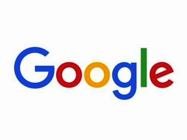
Google introduces a new logo
By Robin-Leigh Chetty 2 September 2015 | Categories: news
They say the only constant is change, and when it comes to the world of tech, those words have never been truer. Now it's time for one of the major players to showcase their own "evolution" as Google reveals a new logo, along with a few other superficial changes.
The company has been around for 17 years now, and in that time has seen four previous versions of its logo. This new design, which bears a striking resemblance to its parent company Alphabet, as far as font style goes, is probably the most significant change since the one it made in 1999.
Open up a Google search homepage now and you'll find a doodle illustrating the change. Google has also released a short video to mark the occasion, showing how the logo has evolved from its humble beginnings in 1998 to now.
Why the change then? According to Google's blog the evolution naturally springs from users interacting with the company's tools and services across a variety of platforms. As such, a bit more uniformity in terms of look and feel was deemed necessary. "These days, people interact with Google products across many different platforms, apps and devices—sometimes all in a single day. You expect Google to help you whenever and wherever you need it, whether it’s on your mobile phone, TV, watch, the dashboard in your car, and yes, even a desktop," said the company in an official statement.
Along with the logo redesign, the standalone "G" has also been altered, featuring all four of Google's mainstay colours, as well as being styled in the new look font. Google says that the design change will soon be rolled out to other devices soon, so we should be seeing the new look pop up on tablets and smartphones in coming weeks.
Most Read Articles

Have Your Say
What new tech or developments are you most anticipating this year?


