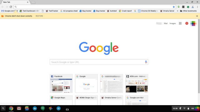
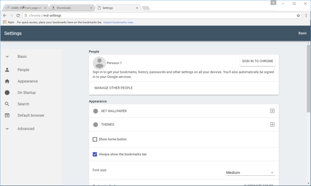
New screenshots of Google Chrome show Material Design in action
By Robin-Leigh Chetty 1 February 2016 | Categories: news
Google's Material Design has been around for awhile now, as we first saw it at Google's 2014 I/O event with a preview of Android L (now Lollipop). The design language was not to be limited to mobile devices alone, but extend to Google's other platforms as well. One such platform still waiting for the Material Design treatment is Google Chrome, with the web browser still decked out in its old guise.


That could change in the near future however, as The Next Web has released a series of screenshots showcasing what a Material Design infused Chrome web browser will look like. As expected, the Material Design's paper-like UI is abound in Chrome, with angular edges and simple aesthetic found throughout. Along with updating the look, The Next Web has noticed a few buttons that have been overhauled as well, with a ripple-like flourish appearing when activated, to mirror that of Android apps.
At this stage, there is no confirmation on when this update will hit Chrome users. Furthermore, the iOS and OS X version of this Material Design Chrome has not been detailed either. For a bit more insight into Material Design's creation, click on the video below.
Most Read Articles

Have Your Say
What new tech or developments are you most anticipating this year?


