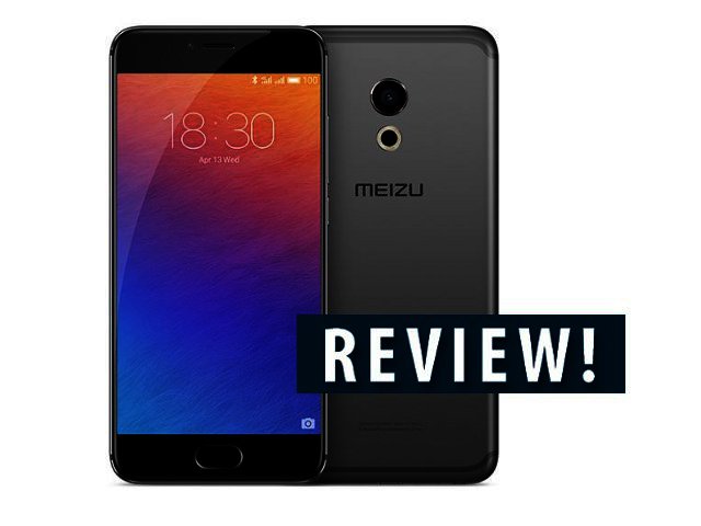
Ever stared at your Android device and thought it needs to look more like an iPhone? Let’s face it, there is only so much one can do with the candybar shape before styles start overlapping, but the Meizu Pro 6 certainly offers more than a passing resemblance to Apple’s flagship. Or actually, depending on how you look at the singular button at the bottom of the screen, also the Galaxy S range. But don’t let this be the only focus of attention, since the Meizu Pro 6 truly has a lot to offer.
Here are four things you need to know about the device.
.jpg)
1. One button operation
The trick the Pro 6 brings to the table is navigation, making use of only a single button. No more do you have the three regulars (back, home and menu), all (well, almost) can be performed with one button.
When you start using the Pro 6 this can be a bit of a hassle, since your thumb is constantly questing for the regular buttons. But as you get used to things, it starts working better, since for the most part, a light press on the button (which doubles as a fingerprint scanner) does the same as back, and a hard press works as home. If you need to see your most recent apps, swipe the screen up.
.jpg)
That covers most of it, but to make the most of of the experience, it’s worthwhile to spend some time getting to know Meizu’s SmartTouch button. This is an on-screen widget of sorts that allows you to bypass the physical button altogether. For example, if you want to switch back to your Chrome session that was interrupted by a WhatsApp message, just flick the button to the left.
It’s a pain-free solution and when I returned to my regular phone, the SmartTouch functionality is what I missed most about the Pro 6.
2. Build quality top notch
Never mind if it looks like an iPhone, Meizu did an outstanding job on the build quality of the phone. With its aluminium casing, the phone is robust and feels reassuringly hefty in hand (160 g), plus the side buttons offer a firm key press.
Stylish curvature makes an appearance on the edges of device, also noticeable on the 5.2” AMOLED Full HD screen, making the Pro 6 certainly an elegant piece of tech. The only stylistic choice that seems out of place is the circle of LED lights at the back underneath the camera lens, but it’s a minor concern.
Talking of which, there are some extra megapixels thrown into the mix thanks to its 21 MP sensor. For regular auto photos, the Meizu does well, providing decent images both indoors and out, although Huawei Mate 9 remains top. Quite captivating too is the Light-field setting that takes a photo where you can adjust the focus afterwards.
3. Good specs
So far, so good, but how does the Pro 6 measure up specs wise? Not bad at all, taking into account its Mediatek Helio X25 processor with ten cores (4 x 1.4 GHz Cortex-A53, 4 x 2 GHz Cortex-A53, 2 x 2.5 GHz Cortex-A72), 4 GB of RAM and 32 GB of storage (no microSD). It combined to provide a score of 99 757 on Antutu, allowing it to beat out, for example, Huawei’s P9 (96 037), but falling short of other flagships, like the Xiaomi Mi5 (115 405).
As mentioned, the Full HD (423 ppi) AMOLED screen is decent (although a tad faint in full sunlight), plus it comes with 3D Press, one of the few Android phones to include this. Although interesting, 3D Press’ usefulness is hindered by a lack of apps that make use of it.
4. Flyme UI so-so
Meizu’s Flyme UI (on top of Android 6.0) does not add anything special to the system, luckily also not really making things worse. It gets the job done, and though bloatware is kept to a minimum, I did receive notifications from the Meizu App Store, which can be turned off.
When you start the device, one of the first things you need to do is install the Google Play Store via the Meizu App Store. Why the Play Store does not come preinstalled only they will know, but unless you want to bother with an understocked app store, installing it is a must. After that, consider downloading the Google regulars (Gmail, Chrome).
One problem that did pop up with Flyme is the Pro 6 closing background apps, even when locked not to do so. For example, listening to podcasts or even Google Play Music via the onboard speaker (which is great by the way) were a chore, since these would simply stop unexpectedly after a while.
Flyme doesn’t measure up to our favourite, Xiaomi’s MIUI, with small things missing – like not learning how you usually share stuff and providing that option first.
.jpg)
A must buy?
Although the Meizu Pro 6’s one-button design is not as a compelling a feature as, say two lenses (Huawei P9), a dual-edge screen (Samsung S7 edge), an ‘extra’ screen (LG V20), or a modular design (LG G4), overall it comes across as a stylish flagship, also well-endowed in the specs department. Yes, there are few bugbears, but the postives far outnumber the negatives.
Finally, a word on price. Some Chinese manufacturers have done a lot to offer value for money Android phones, and Meizu continues on this route. The Pro 6 retails at a decent R8 000 (available here), which, taking into account its overall performance and good-looks, makes for an appealing offer.


