ALSO READ:
Samsung Galaxy S6 review
HTC One M9 review
LG G Flex2 review
Samsung Galaxy A5 review
Before its identity was leaked a few short days before the official debut at Mobile World Congress, the world thought the Galaxy S6 edge would be Samsung's stand alone flagship. Instead Android fans were given two flagships to ponder, one being the Galaxy S6 (review), and the other being the dual-edged S6 edge.
While both devices are well designed, it’s the latter which will turn more heads. The interesting form factor constantly requires further examination, with every inch of this S6's curved frame revealing nuances and details.
Ahead of the curve?
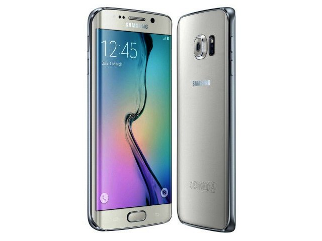
The first time I handled the device, the aluminium frame reminded me of the Motorola Moto X (review). It sweeps down dramatically at each corner and features a thin bezel on either side. As with the standard S6, the polished silver frame will draw comparisons to that of the iPhone 6, particularly when viewing the bottom portion.
Comparisons aside, the S6 edge features a similar 5.1" Super Amoled display, with the notable exception being the curve on either side. Just like its flagship relative, the S6 edge's screen is sharp and clear, as highly detailed imagery and icons pop vividly off the screen. It's listed with the same 577 ppi pixel density as the S6, and as such every bit of this display looks vibrant.
The curve has one drawback however, as content that fits edge to edge (vertically), like websites or full screen apps for example, have the slightest of distortions when closely examined. Held in landscape however, this problem seems to abate somewhat. It's by no means a worrying problem, but some may not like it. One thing users might find difficult, is the handling of the device, as the thin bezels on each side do very little in terms of grip. When you add the glass back cover as well, the S6 edge is a little less tactile than one would ideally want.
Not quite there
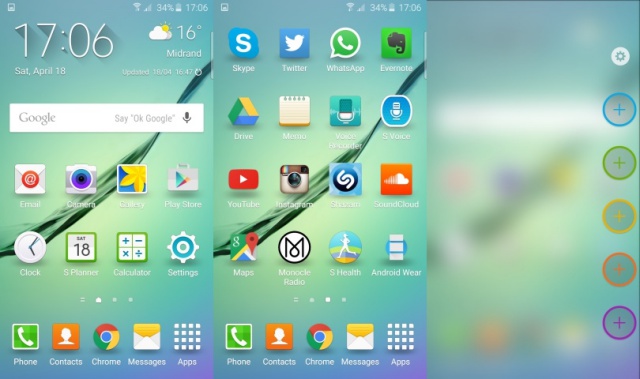
Speaking of the edges, Samsung has packed some added functionality into each one, hence the edge monniker. The right hand side is used for quick contacts, with five colour coded tabs free to assign a contact to. This feature comes in handy if you find yourself constantly messaging a select group of users on a daily basis. Whether or not it is essential to the S6 edge experience is up for debate, but the fact that important contacts are only a swipe away is always nice to have.
The left side of the screen is assigned for specific app info, like WhatsApp messages or Twitter feeds for example. Again, this is a good extra, but does not hold any greater value than the notification window currently available to Android 5.0 (Lollipop) users. For now, the edges feel a bit more like an accessory than an out-and-out core feature, with more attention perhaps required from app developers in that regard.
I'd lump the functionality of the edges in the same category as smartwatches, as both have a lot of potential in terms of increasing productivity, but have not been fully fleshed out with how this will be achieved.
True workhorse
Despite the middling results of the edges experience, the processing performance of the Galaxy S6 edge cannot be faulted, as it yielded very impressive benchmark scores. Sporting the exact internal components as the standard S6, it posted an impressive score of 70 214 on AnTuTu (v5.7). As expected, the Galaxy S6 edge performed equally well on 3D Mark's Ice Storm Unlimited, posting a result of 21 960.


The aforementioned scores come courtesy of 3 GB of RAM and an Exynos 7420 octa-core chipset found internally,both of which result in a responsive and quick multitasking smartphone. One difference is that Samsung has upped the onboard storage options for the S6 edge locally, with the 64 GB version set to land with the first batch of smartphones.
Added to this is the newly improved 16 MP OIS-sporting primary camera that the standard Galaxy S6 touts. Just like its flagship compatriot, the S6 edge's camera is quick on the draw, coming into focus speedily and snapping away in an instant. It also has some of its slight flaws as well, with use in low light conditions yielding slightly grainy images while zoomed in.
Another similarity is the lack of a microSD slot, as Samsung takes a cue from its Cupertino-based rivals. Those worried that 64 GB is not enough, can take some comfort in the fact that 100 GB worth of free OneDrive storage is readily available in the S6 edge.
Final verdict
All in all, the Galaxy S6 edge is a great smartphone with high quality internal specs that deliver an almost unsurpassed flagship performance (at this stage of 2015). For anyone looking for a device that outdoes the S6 edge, you'll find it sitting next to it on the retail shelf - the standard Galaxy S6.
Perhaps still an experiment in design rather than a radical new way to interface with smartphones, the curved edge of the Galaxy S6 edge is yet to realise its full potential. That said, users who opt for it will still receive a stellar device that will prove hard to beat.
At R15 000 for the 64 GB variant, the S6 edge is more expensive than most (even the iPhone 6), and also R4 000 more expensive than the 32 GB standard Galaxy S6. It therefore seems catered to users who wish to talk about their smartphone's design as much as its performance. For that reason, steer towards the standard S6 instead, as the edges are far easier to handle day in day out and doesn’t cost as much.
Although interesting to look at, the curved edges of the S6 edge are right now simply not worth the additional R4 000.


