Google News gets streamlined redesign
By Robin-Leigh Chetty 28 June 2017 | Categories: news
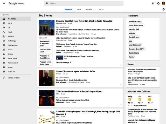
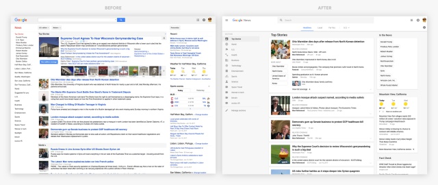
Google has given its desktop News platform the once over. Google News now resembles more of a Google Now user interface, with cards displaying important information on the right hand side, different news filters on the left hand side, and a cleaner layout for news stories centrally.
The company says the redesign will make news easier to access and navigate, with a, "renewed focus on facts, diverse perspectives, and more control for users."

The increased level of control entails the introduction of tabs at the top of Google News, entitled "Headlines", "Local" and "For You". Each of these tabs can be customised when users sign in, with the For You tab adding a mini site of sorts for niche interests.
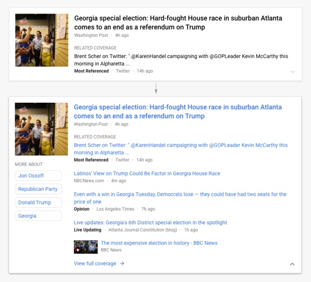
Along with the ability to filter news feeds to a greater degree, the Google Cards containing stories will serve up different perspectives to pieces of news. To that end, a link to the original story will feature, with links to social media coverage, opinion pieces, live updates and the author appearing below.

With an increased level of coverage now a part of Google News, it should be interesting to see how users react to the redesign and new interface.
Most Read Articles

Have Your Say
What new tech or developments are you most anticipating this year?


