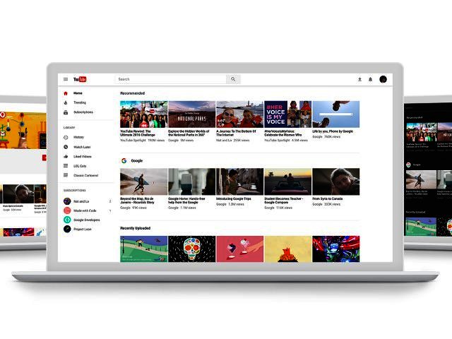
How to check out YouTube’s new redesign early
By Staff Writer 3 May 2017 | Categories: news
Want to get a preview of the new YouTube redesign for desktop? Head here to see how much of it has changed, with the new site being slightly cleaner in our opinion. Brian Marquardt, YouTube’s product manager noted in a blog post that the redesign, “highlights your favourite videos and creators while making YouTube easier and more fun to use.”
The best part of the redesign is the easy accessible Dark theme, which makes it look a lot more like Netflix’s home screen and helps with that nasty glare from your PC screen. Go to your account menu on the top right hand side, and look for the “Dark Theme: On” toggle. Here you will also find your settings, the ability to switch accounts, the creator studio and the capability to switch which country YouTube gets your main content from.
The Dark theme comes from a framework named Polymer, which Marquardt believes will help with the faster rollout of new features. “This is only the beginning - you can look forward to more powerful new features coming soon!” he enthused.
YouTube’s new style makes use of Google’s Material Design principles, practiced across the company’s different applications. Google believes it brings a clearer focus on the user experience, highlighting simplicity, consistency and beauty through design.
Users are encouraged to send feedback about the new design through the “Send feedback” option via the account menu.
Most Read Articles

Have Your Say
What new tech or developments are you most anticipating this year?


