Instagram introduces new logo and streamlines look of UI
By Robin-Leigh Chetty 12 May 2016 | Categories: news
The only constant is change, so the saying goes. This is no more relevant than in the tech world, with Instagram being the latest to undergo some changes. While there is no paradigm shift going on at the Facebook-owned company, it has received some superficial improvements. Most notably to their logo and UI, which iOS and Android users should be able to view from today onwards, depending on the region of the world they find themselves.
A New Look for Instagram from Instagram on Vimeo.
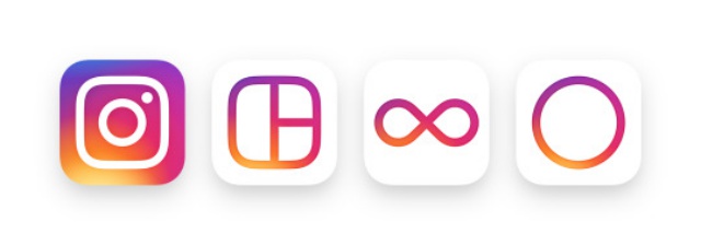
What's new about the logo we hear you ask? Well, the familiar camera is still, this time replaced with a more streamlined designed. There is, however, nods to the the previous logo, as a rainbow colour scheme still remains. Instagram has made similar changes to the Layout, Boomerang and Hyperlapse features of the social media app, keeping in line with the aesthetic of the main logo.

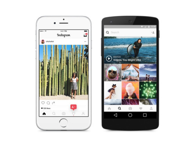
Added to the logos, Instagram has cleaned up the UI, going for a mainly white background, with pink accents and black lettering.
Not everyone is happy with the new look, with a number of users taking to social media to vent their disapproval.
While Instagram is still one of the popular social media apps out there, it has lost some ground to Snapchat in recent months. Could this redesign help bring back some users?

Most Read Articles

Have Your Say
What new tech or developments are you most anticipating this year?


